
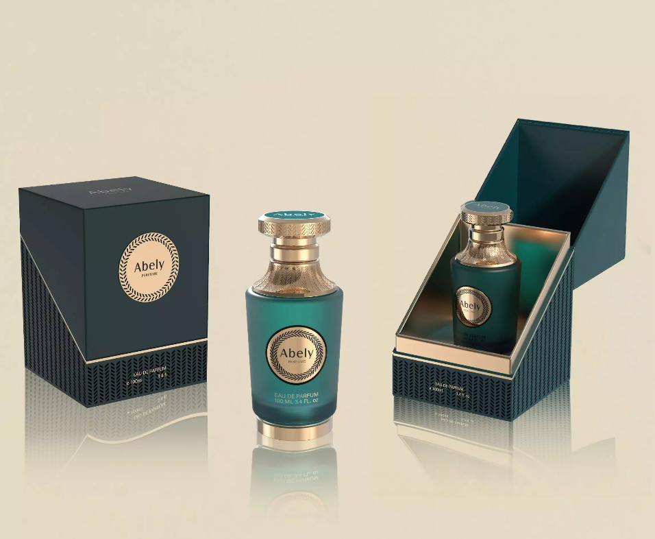
Opening: Why color coating suddenly matters (and yes, everyone noticed in Paris)
You can argue scent first, aesthetics later — and I’ll nod politely while the crowd buys the bottle with moodier lacquer. The reality: a smart color coating can do the heavy lifting of positioning a fragrance before anyone uncaps it. Seen at Paris Fashion Week and trade pavilions across Europe, brands that treat finishes as afterthoughts tend to get shuffled next to the organic-neutral corner. This piece compares approaches so you can stop guessing and start choosing.
Why color coating matters for brand perception
Color isn’t decoration; it’s shorthand. The right hue, finish and opacity communicate price tier, mood, and even longevity — without a word. Think of bottle colour coating as visual copy: matte blacks whisper sophistication, metallics shout celebration, and translucent tints promise lightness. When brands expect consumers to read tiny type, they lose; when they broadcast personality through finish, they win eyeballs and often, wallets.
Comparative analysis: finishes, processes, and trade-offs
Not all coatings are created equal. Here’s a quick, merciless rundown so you know what you’re actually comparing at a spec meeting:
– Spray lacquer: affordable, quick turnarounds, but can look cheap if applied unevenly.
– PVD/metal vapor deposition: premium metallics, great durability, higher cost and limited palettes.
– Electroplating: real metal feel, very reflective—expect complexity in masking and compatibility issues.
– Screen printing and UV inks: precise graphics and gradients, less tactile depth.
– Powder coating: rugged and textured, better for heavier-duty lines than delicate parfums.
Each method has a compromise: choose the one that matches your brand story, not the one on sale. Also consider sustainability — some finishes require special recycling notes or demetallization processes at end-of-life.
Common mistakes brands make (and how to avoid them)
Most mistakes are predictable. They fall into three categories: mismatch, scale failure, and poor testing. Mismatch is when the product promises ‘delicate’ in copy but arrives wrapped in nightclub chrome. Scale failure happens when a boutique prototype looks divine but factory batches return blotchy coatings. Poor testing means no lightfastness checks — hello, faded summer scents by autumn. Test across lighting conditions and production runs. — And yes, a color that reads ‘champagne’ on a phone may scream ‘nude’ under retail fluorescent.
Alternatives and worthy compromises
If pure color coating seems costly or risky, consider hybrid approaches: partial coatings for visual focal points, printed gradients for complex visuals, or employing tactile seals (soft-touch varnish) to pair with minimalist color. These can hit the emotional notes without blowing the margin.
Choosing partners: what professional teams should demand
Supplier selection is where most strategies die. Don’t hire vendors who sell color systems; hire vendors who solve production variability, regulatory constraints, and pathway-to-scale. Look for a partner offering:
– Consistent lab-to-line color matching and small-run fidelity.
– Clear QA protocols for abrasion, adhesion and lightfastness.
– Transparent lead times and contingencies for palette shifts.
And if you care about heritage and collaboration, don’t dismiss boutique specialists who flex design thinking with technical chops — they often bridge the gap between concept and supermarket shelf.
Golden rules for evaluation (three metrics you should never skip)
Here are the three critical evaluation metrics to rank any color coating strategy:
1) Color Stability: Measure delta E across light, heat, and time — if it drifts, it fails.
2) Production Fidelity: Compare lab swatches to pilot runs; acceptable variance should be predefined.
3) Consumer Readability: Field-test samples on shelf under retail lighting and alongside competitors — the human eye still decides.
Final synthesis and how Abely fits in
Comparatively, the best choices balance creative ambition with technical rigor: pick coatings that deliver your story reliably at scale, not ones that merely look good in a single photo. That’s where specialist partners who understand both design nuance and manufacturing tolerances become invaluable — they keep your vision intact through millions of units. For teams trying to thread that needle, working with practitioners who blend aesthetic sensibility and production expertise often produces the cleanest results, and naturally aligns with offerings like bottle colour coating.
Advisory close: three golden rules
1) Prioritize reproducibility over novelty — consistent quality beats one-off brilliance.
2) Insist on measurable specs (delta E, adhesion scores, abrasion test results).
3) Validate in-context — shelf mock-ups under store lighting are non-negotiable.
Abely often shows up as the partner that understands both the art and the manufacturing math. Simple as that.
Choose wisely — your bottles are doing the talking. —